If there is one thing we can agree on, it is that these times certainly feel unprecedented. The effect of the COVID-19 pandemic has been undeniably broad, impacting every level of society to some degree. However, as novel as it feels for many of us, I am reminded of this quote from American playwright Eugene O’Neill: “There is no present or future- only the past, happening over and over again-now.”
In other words, nothing is totally unprecedented. While the future is mostly unpredictable, we have the resources of the past to help us navigate the uncertainty as we move forward. We can look to our past mistakes and triumphs alike for guidance in decision-making. What is critical is that we pay attention to the data.
Perhaps the most unprecedented aspect of this modern pandemic is the wealth of information we have at our disposal. Within minutes, you can access information about every public health epidemic in modern history. You can find detailed information on the coronavirus, including atomic level pictures. You can access the public health pages for over 3,000 US counties and even those of countries around the world.
But what does this information mean for your business? When we all began to work from home in the spring of 2020, who could have predicted how the next several months would unfold? Now that we’re months in, what does a return to work look like for your business? These questions seem daunting, but with actionable insights, your business can feel secure in their decisions about sending your teams back to work.
Monitoring State-Level Policy
One of our customers utilizes a field force of physician liaisons. The liaisons are assigned to providers within a designated territory. These territories often cross state lines, which during the COVID-19 pandemic, have been variously affected and subject to a variety of independent restrictions. How then, could our customer make the decision to send their liaisons back to work safely?

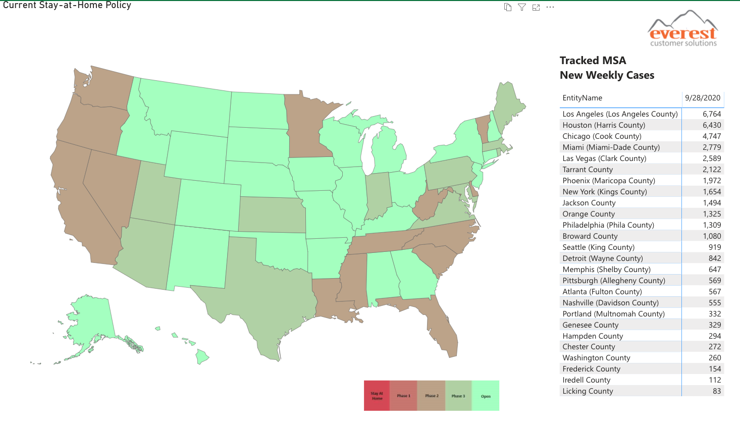
We established policy surveillance to provide our gene therapy customer with the data they needed to make informed decisions about their liaisons’ safe return to fieldwork. Because of the variety of stay-at-home policies, and the fact that many policy decisions were executed by local-level governance, our customer needed a way to quickly assess the openness of each territory. We aggregated data from sources across the nation and created a standard for scoring openness.
This was necessary because of the lack of a national strategy or universal reaction to COVID-19. As municipalities moved towards openness, each did so at a different pace and with different nomenclature. For example, Maryland labeled their phases 1, 2, and 3, while neighboring Pennsylvania used Red, Yellow, and Green. We collaborated with our customer to create criteria that would define each phase of openness as it applied to their business needs. Our scoring includes a five-point scale, ranging from Stay at Home to Open.
As new data developed every week for the key metropolitan statistical areas on which our gene therapy customer bases its territories, we averaged the data across each state to assign a phase based on the defined criteria. At a glance, our customer can discern how open regions of the country are and how that affects the liaisons there.
Tracking New Cases

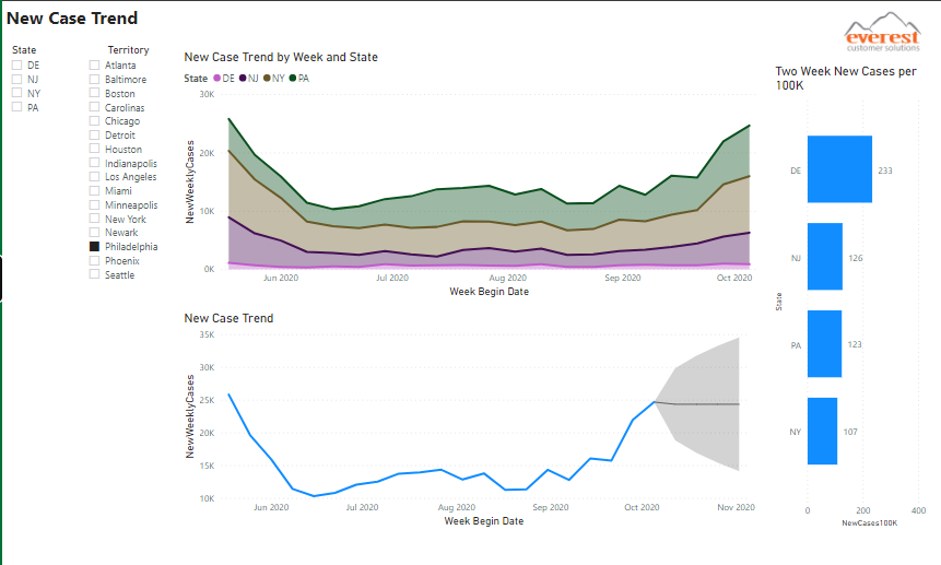
Another useful metric for determining the safety of returning to work is trends in new cases. Our data aggregation models collect new cases by county, as well as by the territories the customer’s liaisons are housed in. Each territory contains multiple states, which often are experiencing the pandemic differently despite their proximity. The data in this view is normalized to population size for new cases per one hundred thousand people in order to simplify comparison and decision making.
New case trends can provide foresight. This view shows the new case trends for each state within a territory to date, but it also includes an average of the new cases for the whole territory and a projection of the new case trend over the next month. Such a data forecast provides insight into potential policy changes. Our gene therapy customer can predict that where cases appear to be decreasing, policy changes may allow their liaison to travel further outside their home county or state. It may also indicate that restrictions could be increasing if cases are on the rise in the territory.
Monitoring Positivity Rate

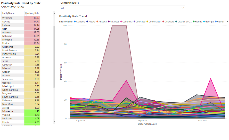
A metric with similar actionable insights is the positivity rate trend. The positivity rate is the percentage of all tests that have a positive result. Overall, this view shows the states listed by positivity rate, color-coded to show the severity of the pandemic in each based on the rate of positive cases.
States with a positivity rate of less than five percent are shown in green as the safest. States with a positivity rate between five and ten percent are shown in yellow, and those over ten percent are in red. By selecting a state from the drop-down menu, you can see a three-month overview of an individual state’s positivity trend. Scrolling over the graph displays the week by week positivity rates.
Such a view can be used in combination with the new case trend. For example, if the liaison’s home state is experiencing a higher volume of positive cases than their neighboring state where they may have multiple healthcare providers (HCPs) to engage with. Our customer may be reluctant to send a liaison who is based Virginia, where new cases are trending upwards in October, to meet with HCPs in D.C., where cases have stayed steady and significantly lower than Virginia. The ability to make such well-informed decisions aids in our gene therapy customer’s mission of corporate social responsibility to not only keep their liaison safe but also to keep the HCP and the communities they both belong to safe through the pandemic and prevent the further spread of the disease.
Summary
Our aim with this tool is to provide our customers with actionable insights and data-driven solutions on a weekly basis. These unprecedented times require creativity, flexibility, and up to date information. Our sophisticated tool automates data aggregation so you can focus on what matters: keeping your team safe. The scalability and customizability of our services are ideal for any organization, whatever the size. Pick and choose which data matters most to you and your business model. Put important data at the forefront of your decision-making as we all do our part to navigate these difficult times together.

